Using Images

The img tag

Basic syntax for the img tag

The img tag is the simplest and most common way to display an image in an html page. smiley It requires a src attribute, which indicates where the browser will find the image, and an alt attribute, which provides a textual version of the image for screen-readers.

img src="path/to/image.jpg" alt="My image"
  1. Add an img in the first paragraph of this section. Use this src: https://wudesign.me/resources/using-images/images/smiley.jpg.
  2. Be sure to include the alt attribute, with a meaningful value.

An img element is, by default, an inline element, so it will wrap with other inline elements on the page.

Sizing an img

img tags can be sized with CSS. Like other elements, you can add an id, class, or other attributes as you see fit in order to assist with styling. Generally, it is best to set only width or height, not both. If you set only one, the browser will set the other automatically in order to maintain the aspect-ratio of your image source file.

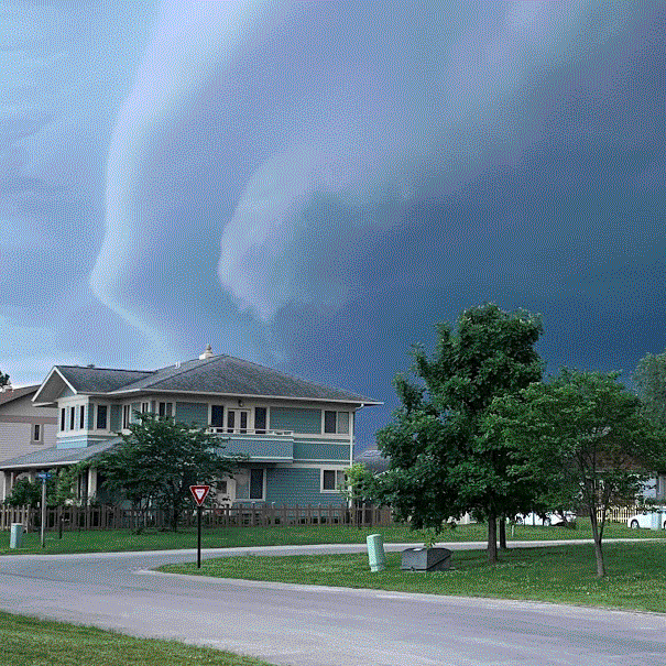
  1. Add an img below this set of instructions. Use src: https://wudesign.me/resources/using-images/images/shelf-cloud-wide.jpg.
  2. The image will be huge. So, add class="full-screen" to the tag, then use that class as the selector for a style rule that sets width: 100%; on the image.
wide shelf cloud

Cropping an img

Sometimes your source image doesn't match the aspect-ratio of the space you need to fill. What if we want to put our wide image into a square? First, let's try just setting both width and height.

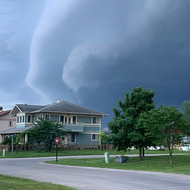
  1. Add another img after this set of instructions. Again, use src: https://wudesign.me/resources/using-images/images/shelf-cloud-wide.jpg.
  2. This time, add class="square" to the tag, and use that class as the selector for a style rule that sets width: 280px; height: 280px; on the image.
cropped wide shelf cloud

The image is stretched! Not what we wanted. We need to tell the image to be cropped, not stretched.

  1. On your .square ruleset, add object-fit: cover;

Now the image is cropped, instead of stretched. The cover value tells the browser to scale the image proportionally such that it just covers the entire area of the img tag, but no larger. (You can also use the contain value, which scales the image proportionally to fit entirely inside the area of the imgtag.) The image will be centered by default, but the center is not really the best part of this particular image, so let's reposition it.

  1. On your .square ruleset, add object-position: left center;

The object-position value can have two parts, the first for the horizontal position, the second for vertical position. We can use words like left, right, and top, or numerical values like 100px or 20%.

Background images

Background image syntax

The img tag is useful when the image is part of your actual content, but it's often not ideal when using an image as a style element behind other content. CSS provides a mechanism for using images as backgrounds to other elements. Let's add a background image to the example definition below.

  1. Create a css ruleset with selector .background-image-example, and add this rule: background-image: url(https://wudesign.me/resources/using-images/images/shelf-cloud-vertical.jpg);

Shelf Cloud: A low-hanging, well-defined, wedge-shaped formation that occurs along the leading edge of a gust front in a thunderstorm. Shelf clouds most often form just ahead of intense lines of thunderstorms.

You'll see that the background image only extends as far as the edges of the element being styled — so in this case, only a few sentences. Let's add some padding to that div, so we can see more of the image.

  1. For .background-image-example, set padding: 10% 5% 45% 40%;

Sizing and positioning background images

We can use background-size: cover; to scale the background image to fit its container, similar to object-fit: cover; for img tags. Similarly, we can use background-position to control the position of the image within the frame. The background-position value can have two parts, a horizontal and vertical component, just like object-fit did. In this case, center 20% works nicely.

  1. Set background-size: cover;
  2. Set background-position: center 20%;

Preparing images for the web

Selecting the right file type

A number of factors come into play when selecting which file type to use for a given image. Is the image raster (like a photo, comprised of a grid of pixels), or vector (described by mathematical equations, like an illustrator file)? Is it going to be displayed at large sizes and therefore must be well-compressed to minimize download time, or will it be very small, such that compression won't matter as much? Does it require transparency? Must it animate? The following table compares the four most commonly-used image file types.

A comparison of image file types
jpg gif png svg
jpg smiley gif smiley png smiley svg smiley
jpg shelf cloud 36KB gif shelf cloud 138KB png shelf cloud 422KB
Not applicable, SVG is vector only!
Pros:
  • Very small file size for photos
Pros:
  • Can be animated
  • Small file size for solid colors
Pros:
  • Lossless compression
  • Full transparency
  • Works for photos and graphics
Pros:
  • Lossless compression
  • Full transparency
  • Infinite scaling
  • Usually small file size
Cons:
  • Lossy compression
  • Adds artifacts in areas of high contrast
  • No transparency
Cons:
  • limited color palette
  • High noise/banding
  • Larger file size
  • 1-bit transparency (rough edges)
Cons:
  • Very large file size
Cons:
  • No support for raster images

Managing file size (and therefore download time) for raster images

Image fidelity and file-size are inextricably linked. Both are a function of the number of pixels in the image, and the amount/type of compression applied. These are both variables over which you have control, and which you must control in order to find the right balance between quality and download-time.

First, decide what is the maximum width at which this image is displayed? For instance, in this document, the main column is constrained at 800px wide, and will never get wider. An image wider than 800 pixels is therefore unnecessary, we use crop and/or image sizing tools in Photoshop to make the image be 800px wide.

Second (at least for a jpg image), we decide how much compression to apply. This is best done using Photoshop's 'Export As...' feature, which opens the image in a window that allows you to try out compression settings while seeing their effect on image quality. In most cases, jpg compression higher than 60% is unnecessary, and 35-45% is often fine.

Taking these two steps when preparing an image for use can make a dramatic difference in file size, and therefore download time. It's not uncommon to reduce the file to a 10th or even 100th of it's original uncompressed size, meaning it will download more quickly — by orders of magnitude.

  1. Create an images folder for this project.
  2. Use a photo of your own, or right-click and "Save Image As..." the wide-angle cloud photo above.
  3. Open the image in Photoshop, and use File > Export > Export as... to save a jpg version of the image that is appropriately sized and compressed as much as you can before it noticably degrades.
  4. Save the image into the images folder you created.
  5. Add an img tag inside the figure element below this set of instructions. The src will be something like src="images/my-image.jpg".
  6. Create a style rule that sets this image to be width: 100%;
  7. Put the image's pixel width, the compression setting you used, and the resulting file size into the figcaption.
wide shelf cloud
<761.33px wide, 77.38% jpeg compression, 157KB>